INSIDE
“Are you really living the life you want to?” This question probably puts more than one person in a bind. Today’s worries and complications cause us to often silence our authentic self to simply adapt to the moment and try to survive.
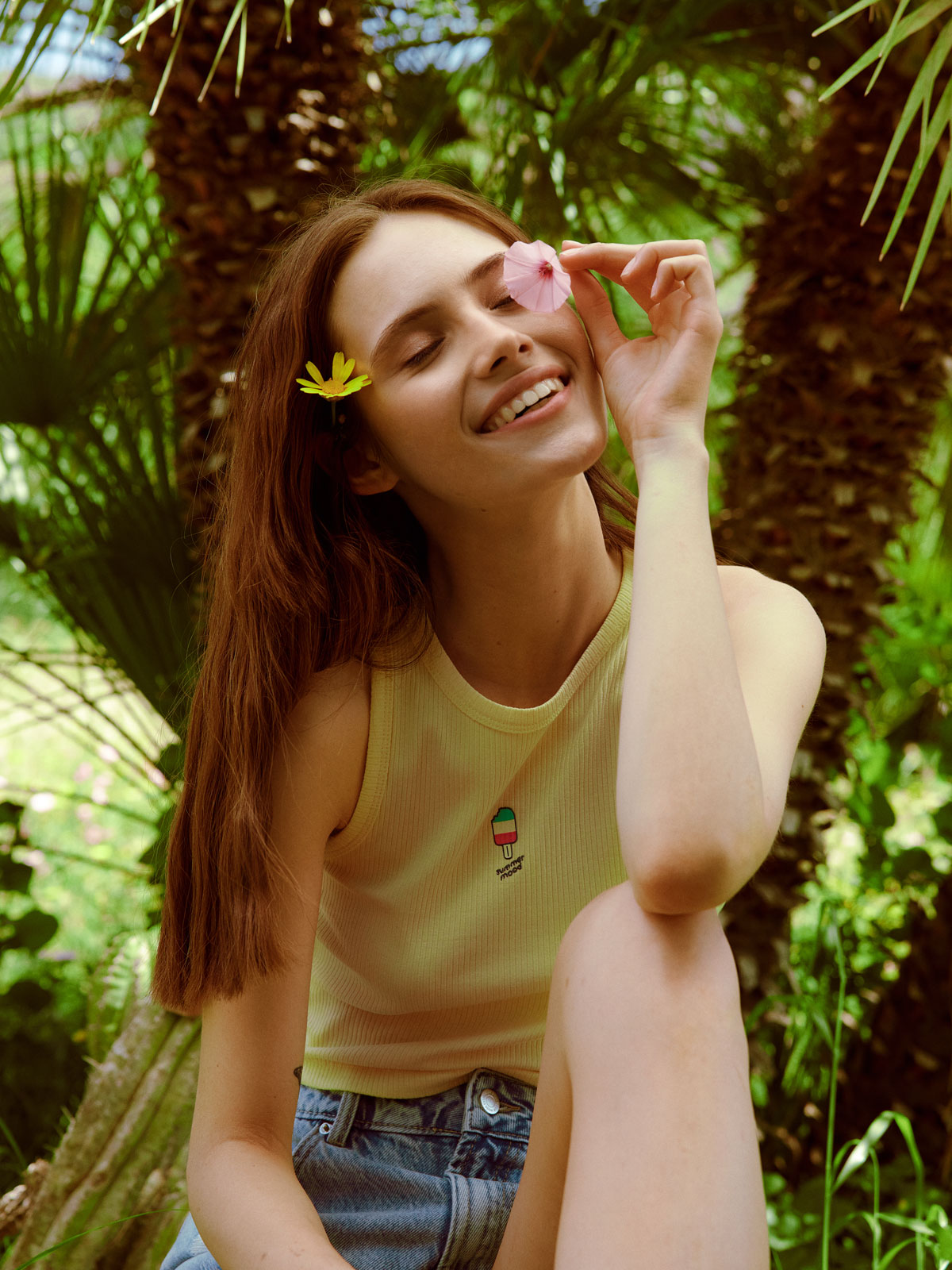
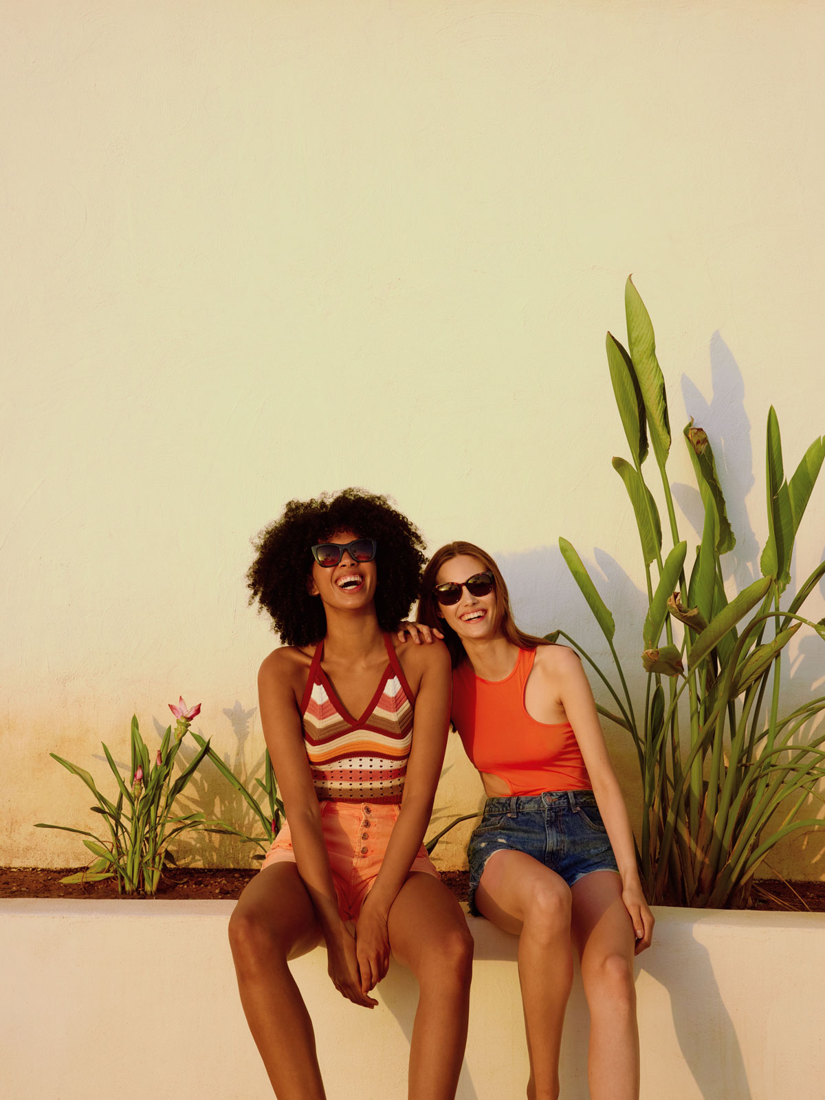
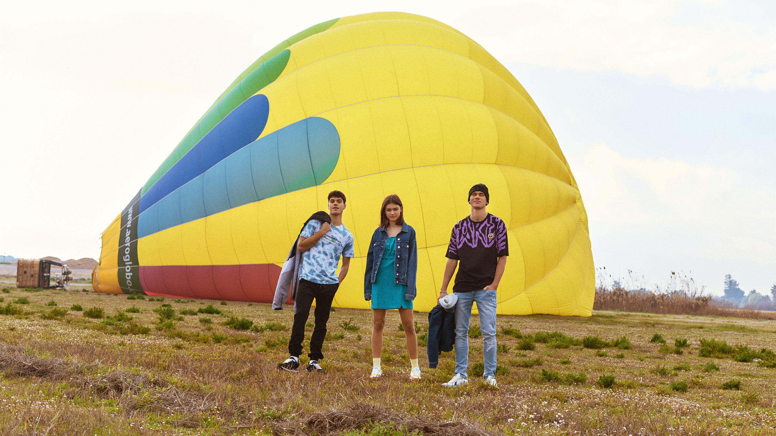
Everyday life and routine stain our lives in grey. We need a touch of colour that connects us back to ourselves and our world, a spark that helps us dress up every second to enjoy life to the fullest.
Challenge
To bring back a Spanish icon of accessible fashion. To give it a new positioning that connects it with today’s market, in the face of huge international competitors in the fashion industry.
Solution
We worked with the Inside team to carry out an in-depth analysis of the brand and its universe. We concluded that Inside was no longer a brand that represented or understood its audiences. It had become just a channel for selling clothes and did not fit into an increasingly emotional and human industry. The path was clear: reconnect Inside with its past, present, and future community.
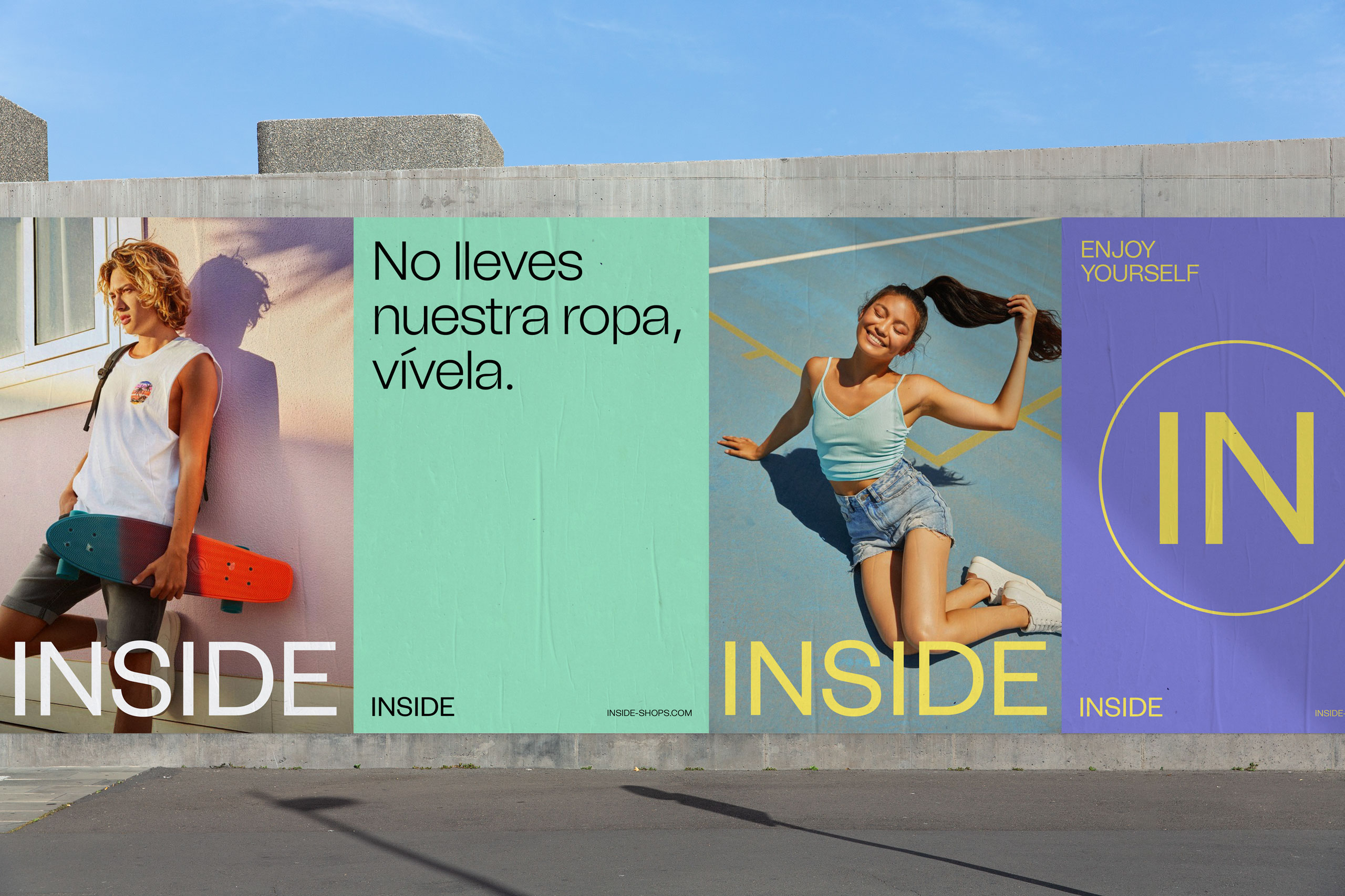
We conducted research to understand the motivations and personalities of all of Inside’s audiences. One common factor caught our attention: We were dealing with an audience that considered themselves to be hedonists, people who seek pleasure and well-being in all areas of life.
«Nuestro problema es que no sabemos a quién nos dirigimos»
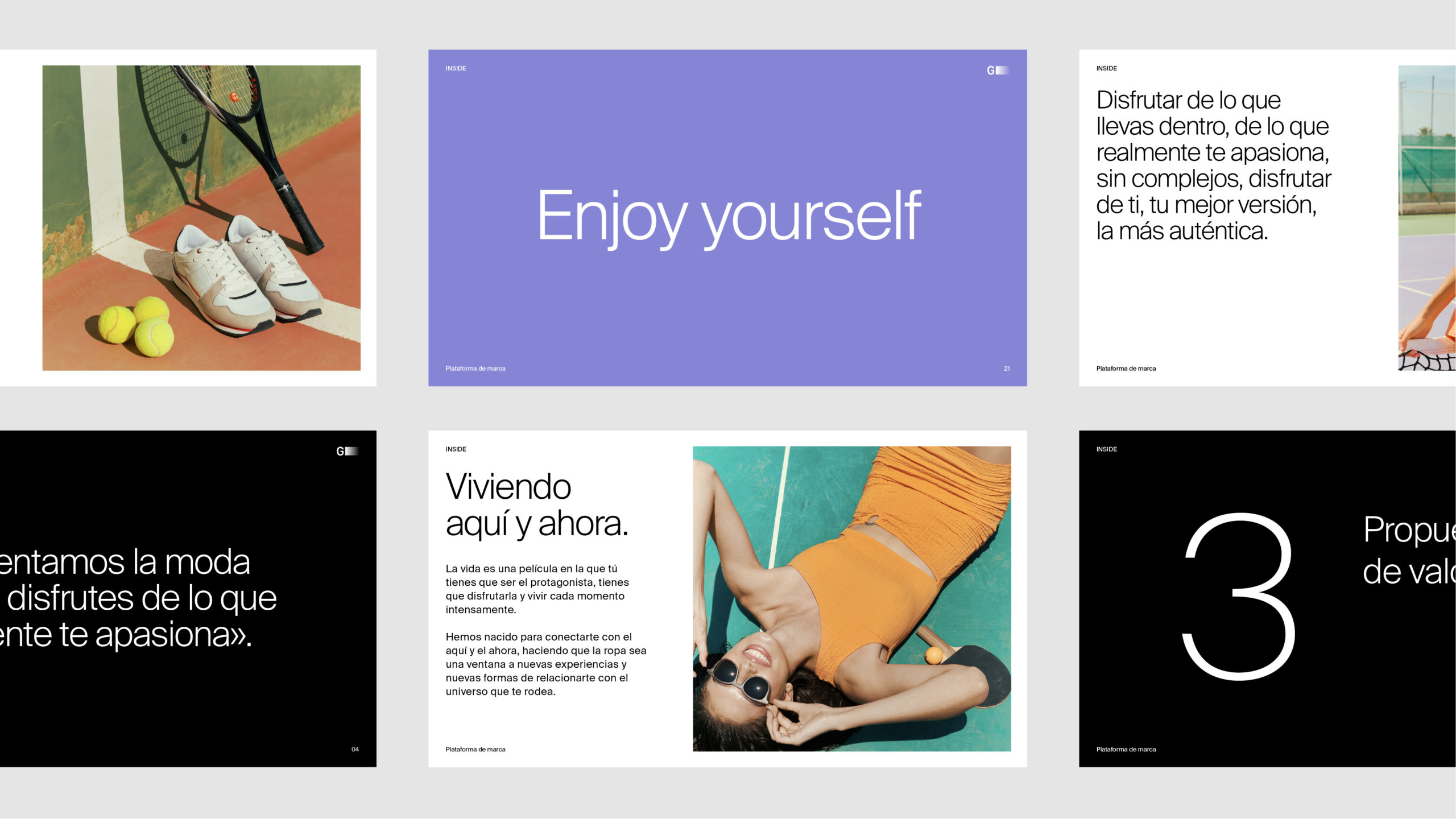
We captured this positioning with a vital, vibrant and passionate personality; and we articulated it with a new tone of voice that would allow Inside to interact and relate with its audiences in a unique and differential way at any point of contact, physical or digital.
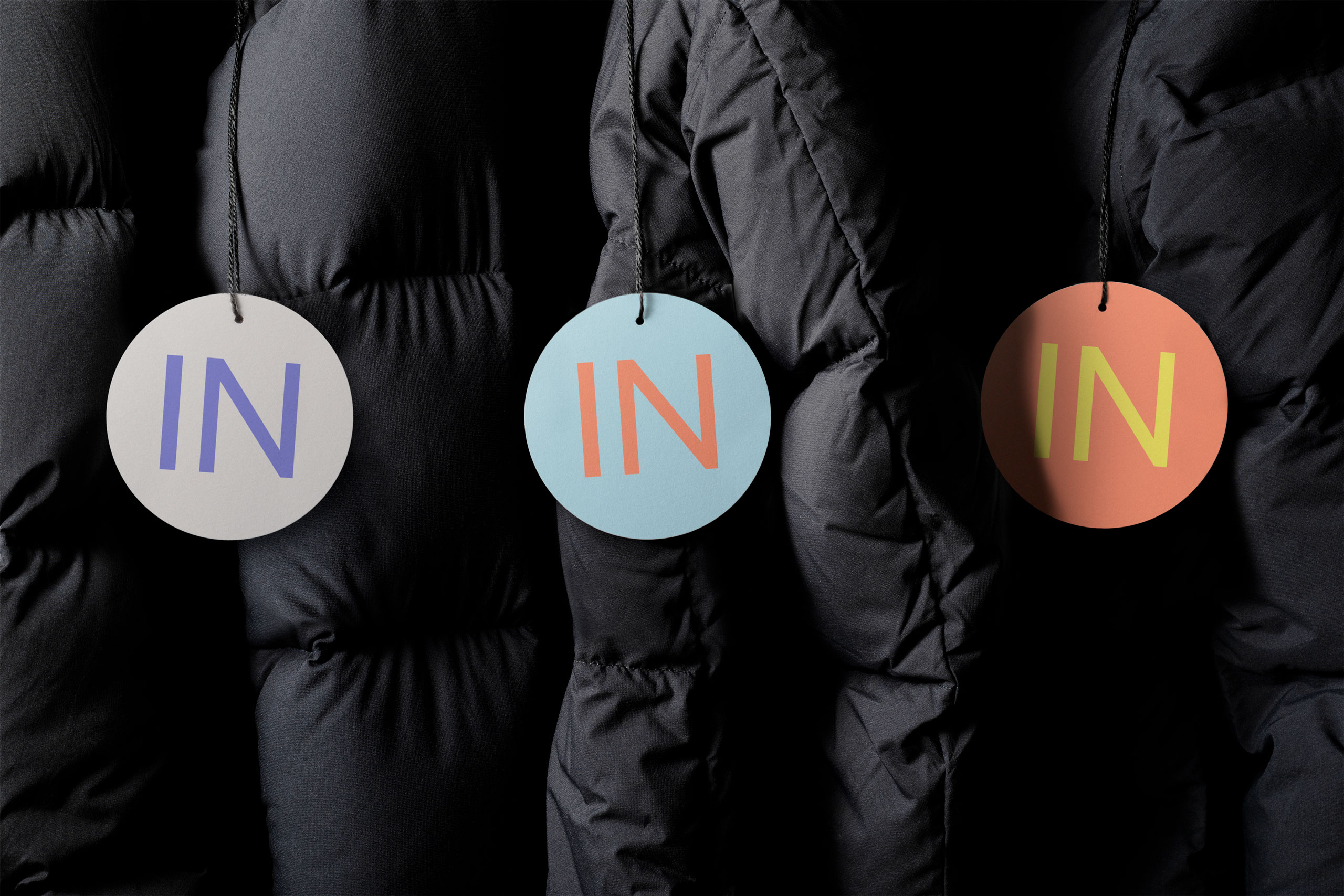
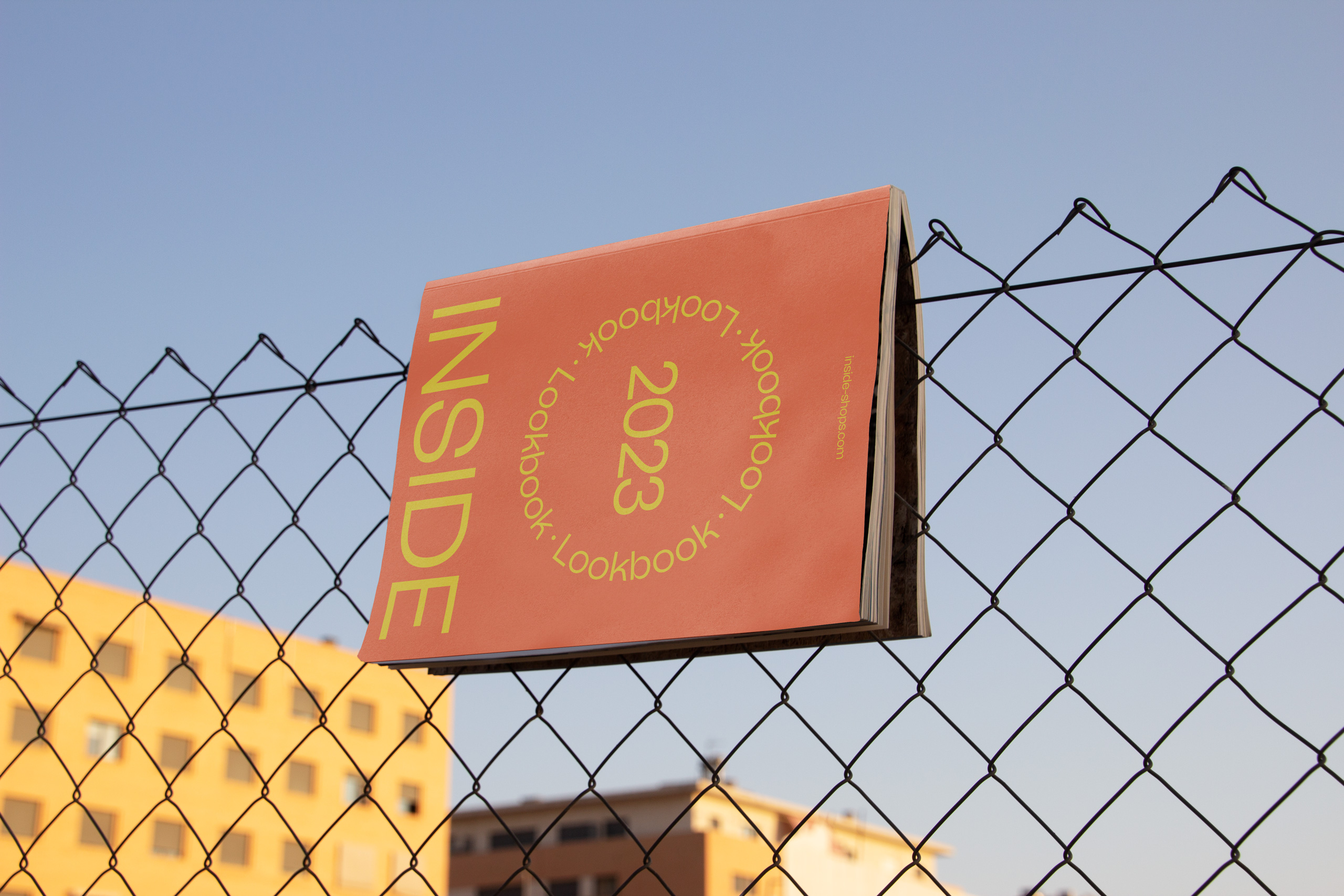
Inside’s visual identity starts from the premise: give prominence to every audience. We decided to evolve the logo, moving it towards more neutral and versatile codes that would allow it to adapt to every Inside story. We also accompanied the new logo with a vital chromatic palette that transmits and projects the new personality.
The circle is another key element in their identity. It is part of the brand’s visual legacy, so we decided to redefine its role, transcending it from a mere geometric shape to a playful narrative element that frames and highlights moments, stories, and experiences.
A new Inside was born, an evolution in which the brand reconnects with its name, giving it new meaning and connecting it to the quest to enjoy every second, bringing out everything you have inside.
AWARDS
BEHANCE / INDESIGN